
The Home Gym Reimagined: Why Yours Should Feel Like a Luxury Hotel, Not a Leisure Centre
The reason most home gyms fail has nothing to do with equipment. It's the room itself. A corner of a spare bedroom with a yoga mat rolled out next to a pile of boxes is not a space that motivates anyone to do anything other than close the door and pretend it doesn't exist.
The home gym that actually gets used is one you want to be in. Which means it needs to be designed — not kitted out, but genuinely considered, the same way you'd think about any other room in the house.
This one has been.
Starting with darkness
The near-black walls set an immediate intention. This is a room that takes itself seriously, and the deep charcoal palette communicates that before you've even noticed the equipment. There's a psychological logic to it — dark walls absorb rather than reflect, creating a focused, contained energy that white walls in a gym context never achieve. White says clinical. Dark says purposeful.
The crown moulding and arched windows keep the space from tipping into severity. These are architectural details that remind you this is a home first — a well-dressed room that happens to contain a spin bike, not a converted garage that happens to have curtains.
The lighting: doing the most work in the room
Two light sources, both chosen with precision. The smoked glass cluster chandelier overhead provides ambient light that is warm rather than harsh — a deliberate departure from the strip lighting that ruins most home gyms visually. The candlestick wall sconce adds a secondary, softer layer that creates atmosphere in the evening when overhead lighting alone would feel too exposing.
The result is a room that is genuinely lit rather than simply illuminated. It makes a significant difference. You can work hard in a room that feels this considered without it feeling like effort.
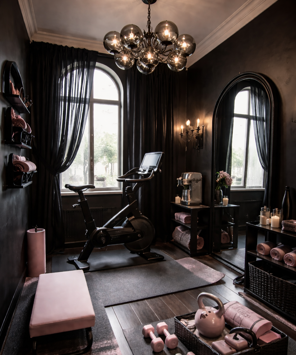
The pink: why it works against the dark
Blush pink as an accent against near-black is a combination that should be more widely used than it is. The pink bench, dumbbells, kettlebell and rolled towels are not decorative afterthoughts — they're the palette's relief valve, the element that stops the dark scheme from becoming oppressive and gives the eye somewhere warm to land.
The specific choice of blush rather than a brighter pink is important. It is soft enough to feel luxurious rather than sporty, which is exactly the right register for a space that is trying to feel like a private members' club rather than a gym floor.
The wicker baskets corralling the accessories are the kind of detail that separates a designed space from a decorated one. Storage that looks like storage is always a missed opportunity. Storage that looks like it belongs — same tonal palette, same material sensibility — disappears into the room.
The details that complete it
A coffee machine on the side shelf next to candles and fresh flowers is the detail that makes this room feel genuinely aspirational rather than merely beautiful. It is a room you arrive at, make yourself something, and settle into — not a room you endure for forty minutes before escaping. That shift in relationship to the space is the whole point of designing it properly.
The full-length arched mirror reflects the window light back into the room and extends the sense of space without doubling the visual noise. Practical and considered in equal measure.
The takeaway
A home gym does not need to look like one. It needs to feel like a room you have a reason to enter — and once you're in it, a reason to stay. Dark walls, considered lighting, a single accent colour running through every accessory, and one or two details that have nothing to do with fitness and everything to do with pleasure. That is the formula.
The equipment is almost incidental. The room is the motivation.